
Bloem Consulting needed a brand refresh, after designing their original brand identity they discovered a high customer interest in their partner company Battersea Bloem which is a florist. Motivating them to desire a more flower-centric design that streamlined the two businesses.
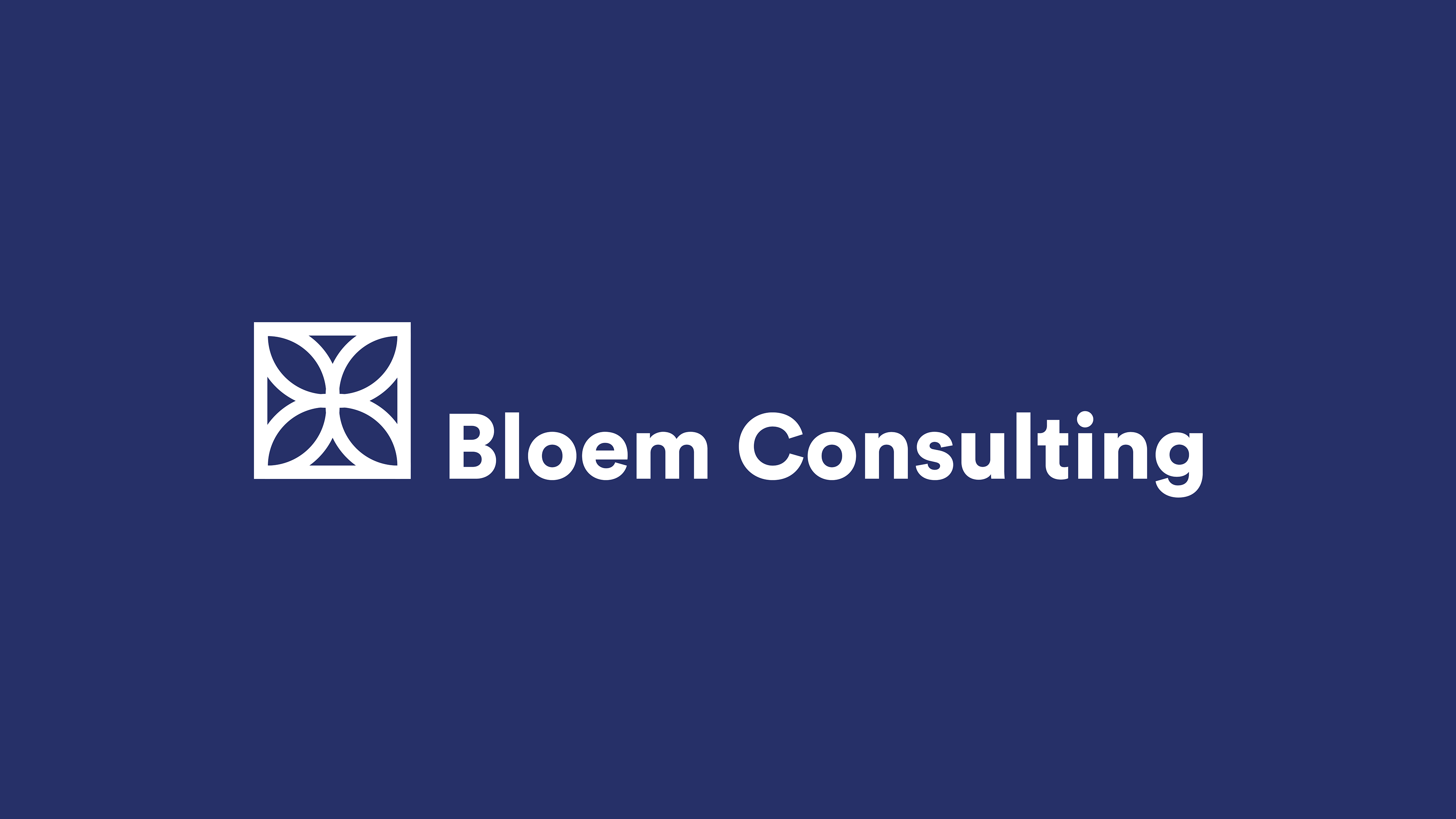
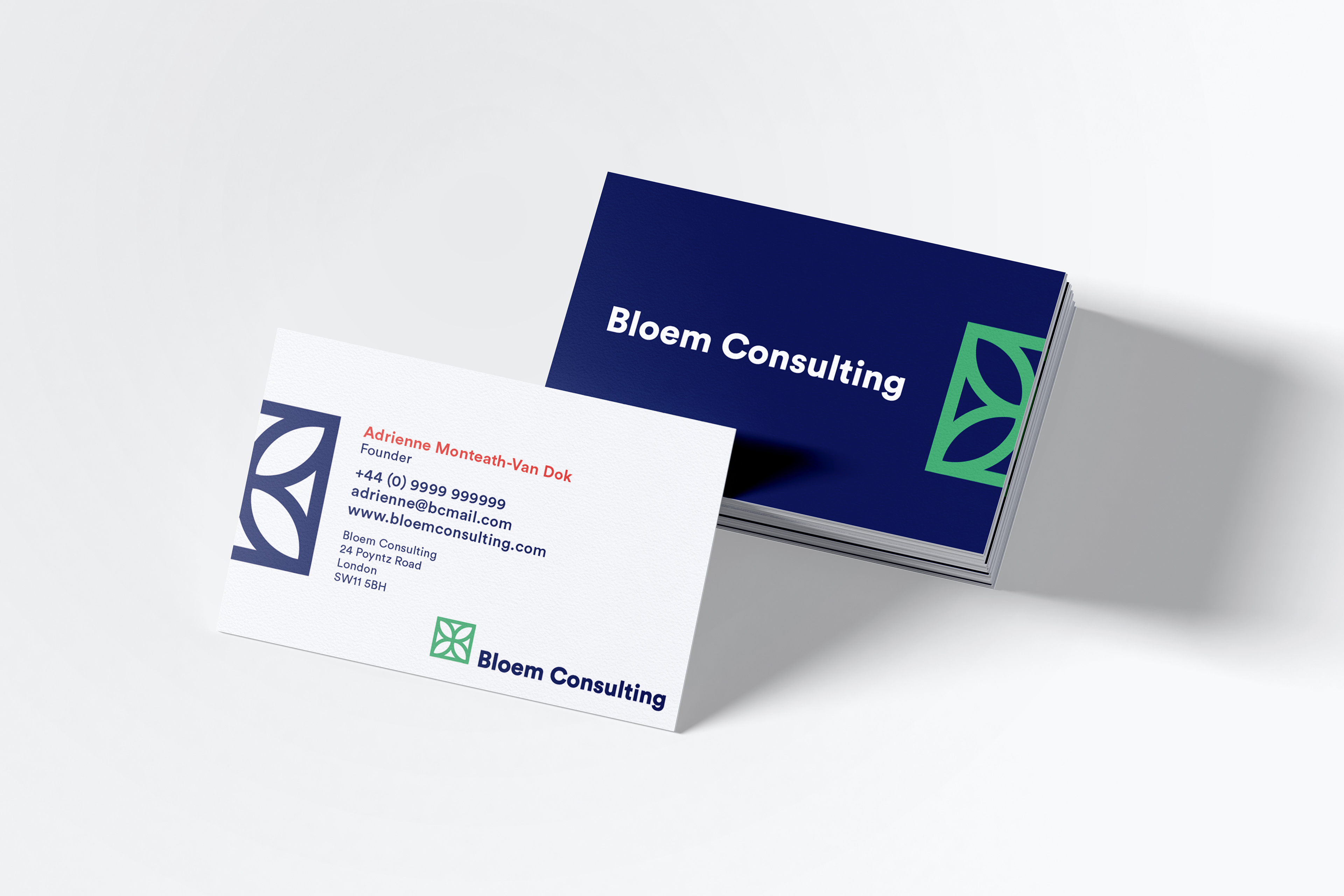
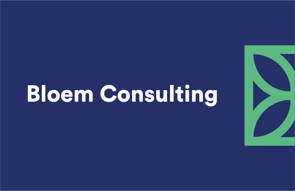
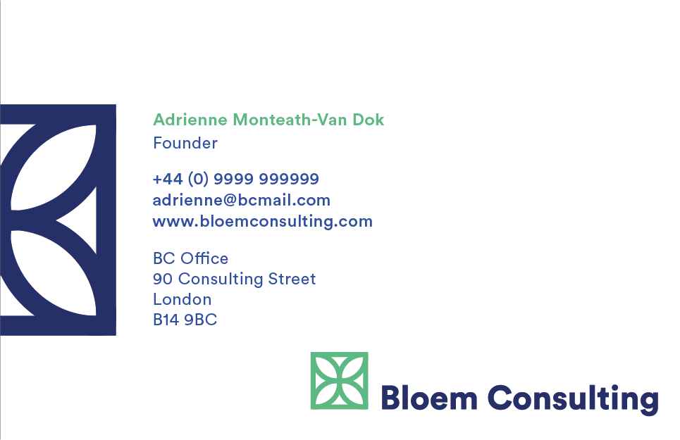
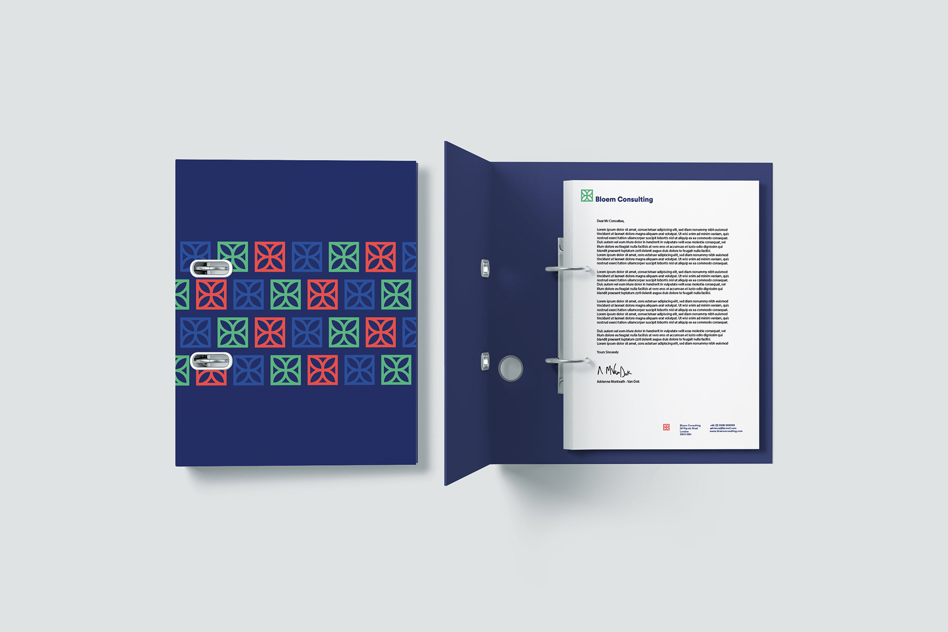
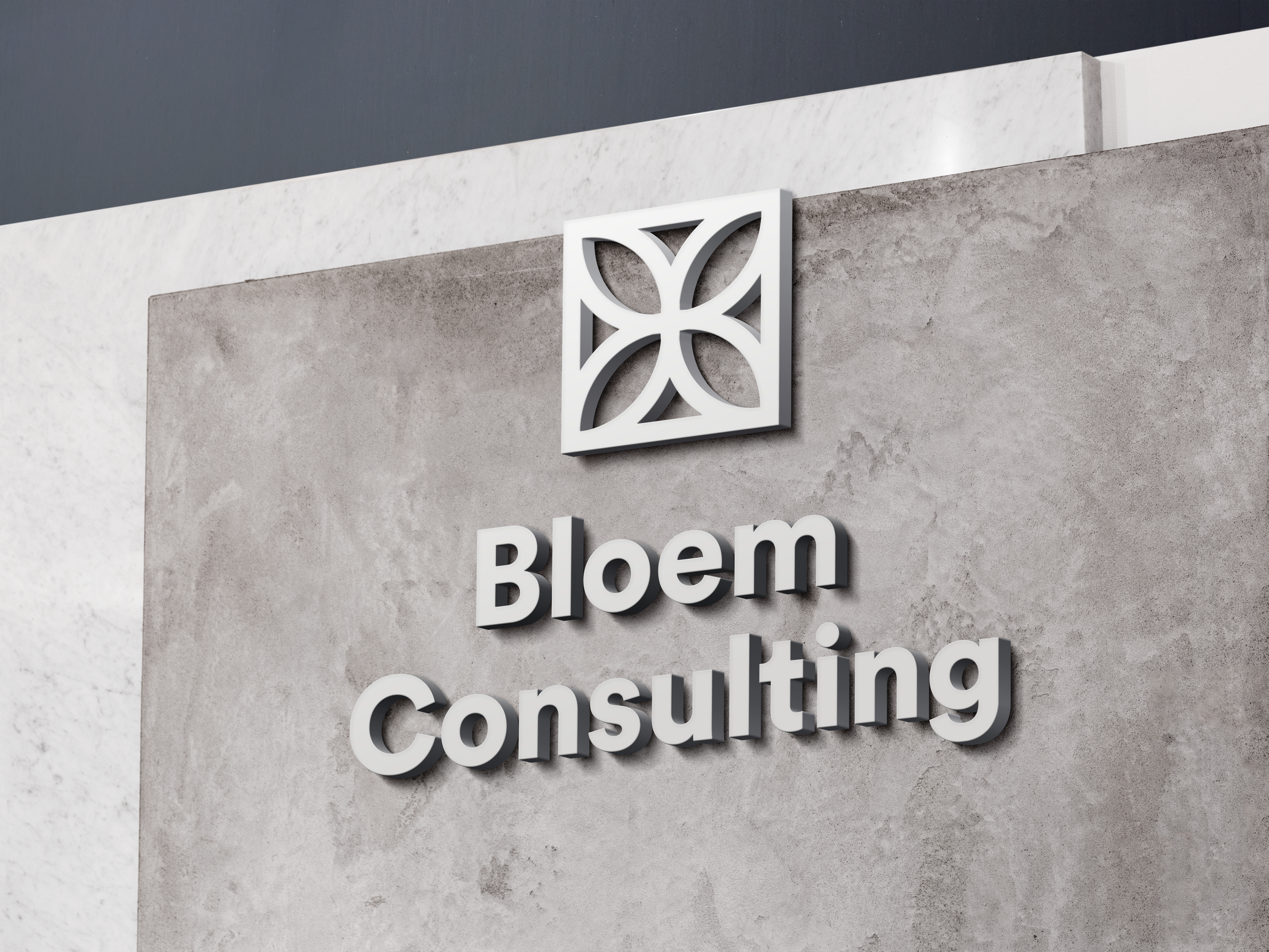
Solution: Created a symmetrical flower petal-inspired logo that can still be used in the corporate world, that can also be utilised in a colourful tiling pattern reminiscent of the love of the outdoors. Incorporating a deep blue colour scheme to establish a theme of trust with the brand, with brighter secondary colours to bring freshness and vibrancy to the branding.
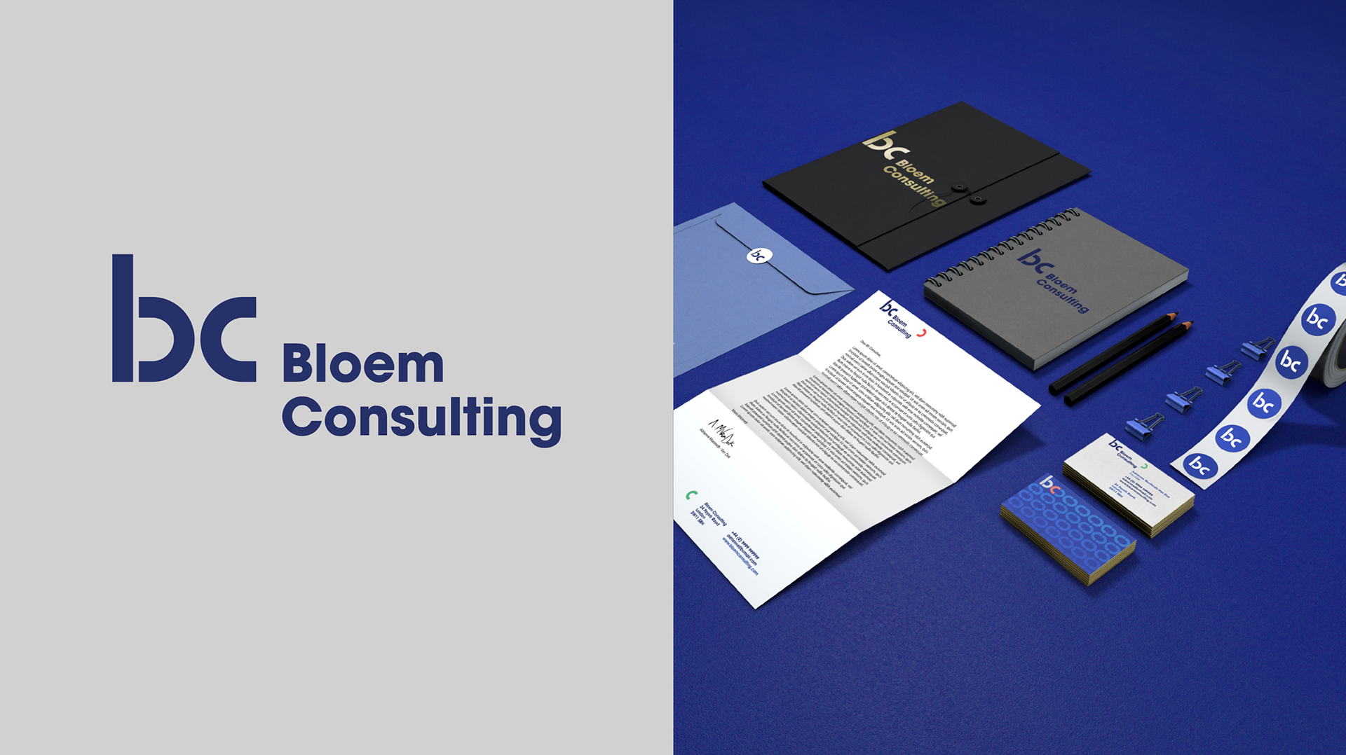
PREVIOUS BRANDING
THE REBRAND
BUSINESS CARD DESIGNS


LETTERHEAD & FOLDER DESIGN
SIGNAGE MOCKUPS

THANKS FOR WATCHING
For Branding enquiries please use the 'Contact' tab at the top of the page.